Color Theory in Art Curation: When to Complement vs. Contrast Your Palette
A working framework for deciding when a work of art should settle into a room's color scheme, and when it should push against it.





Key Takeaways
- The choice between complement and contrast comes down to one question: should this work hold the room's mood, or interrupt it? Color is relational. A work's color shifts depending on what sits beside it, so wall color, furnishings, and art have to be chosen together rather than in isolation.
- The choice between complement and contrast comes down to one question: should this work hold the room's mood, or interrupt it?
- Museums treat wall color as a deliberate curatorial tool. The white-walled room is one option among many, and frequently the wrong one for a home.
- Light is part of the palette. In Houston and Dallas-Fort Worth interiors with strong daylight and wide glazing, a relationship that reads well at midday can fall apart by late afternoon, which is why we test works in the actual space before committing.
The decision behind every well-placed work
When a museum hangs a painting, the curator chooses the wall to serve the art. In a home or a hotel, the order usually reverses. The room comes first, and the art has to find its place within a scheme that furniture, millwork, stone, and paint have already set. Our work as advisors sits in the space between those two: we manage the relationship between a collection and the interior it lives in, so that neither cancels the other out.
Most of that relationship is decided by color. A work can echo the palette around it and settle into the room as part of the atmosphere, or it can sit against that palette and become the thing the eye goes to first. Designers already know the color wheel. The harder question is not what complementary or analogous means. It is knowing, work by work and room by room, when to reach for harmony and when to build tension on purpose.
Color is relational, which is why you cannot choose in isolation
The single most useful idea here is also the oldest. In Interaction of Color (1963), Josef Albers showed that no color is fixed. The same hue reads differently depending on what surrounds it. A muted ochre looks dull on a beige wall and starts to glow when the wall behind it turns a cool slate. Albers called this simultaneous contrast, and his demonstrations of how color deceives the eye are still taught in every serious design program.
For curation, the lesson is practical. You cannot pick the color of a work and the color of its setting as two separate decisions and assume they will add up. A canvas chosen against a white studio wall will not behave the same way over a deep-green dining room or a plaster the color of wet sand. This is why we resist signing off on a placement from a swatch and a photograph. The colors have to be judged together, in the room.
When to complement: letting a work settle into the room
Harmony is the right move more often than people expect. Reach for it when the work's job is to hold a mood rather than break it.
Quiet, restorative spaces are the clearest case. A bedroom, a residential study, a wellness suite in a hotel, or a focus room on a corporate floor all benefit from artwork that sits within the room's value and temperature rather than fighting it. Analogous relationships, where colors sit near each other on the wheel, and tonal palettes that use one color in several values, let a work belong without demanding attention.
Harmony also protects delicate work. Works on paper, pale abstraction, and light-keyed photography are easily overwhelmed by a saturated wall. Here a principle from the National Gallery in London is worth borrowing. Its first director, Charles Eastlake, observed in the 1840s that a picture shows to advantage on a ground brighter than its darks and darker than its lights. A mid-tone wall, neither stark white nor heavy, gives a quiet work a cushion of air to rest against. The Gallery has favored deep reds and greens through its recent rooms for that reason: those grounds carry gilded frames and aged varnish better than white does.

Continuity is the third case. When a collection runs across a sequence of spaces, such as a hotel's guest corridors, a suite of executive offices, or the connecting rooms of a large home, harmony is what makes the works read as one voice instead of a series of unrelated incidents. A shared temperature or a recurring accent color across the hang does that quietly.
The risk of harmony is that a work can recede too far and turn into decoration. A 2017 University of Washington study found that visitors often do not consciously register an exhibition's wall color even as it changes how bright and colorful the room feels to them. That cuts both ways. Harmony works on people below the level of attention, which is its strength, but pushed too far it can make a serious work disappear into the upholstery. When a client has bought a work because it matters to them, vanishing into the scheme is a poor result.

When to contrast: making a work the event
Contrast is the tool when the work is meant to be the event in the room: the surface a guest photographs, the canvas that stops a client mid-sentence.
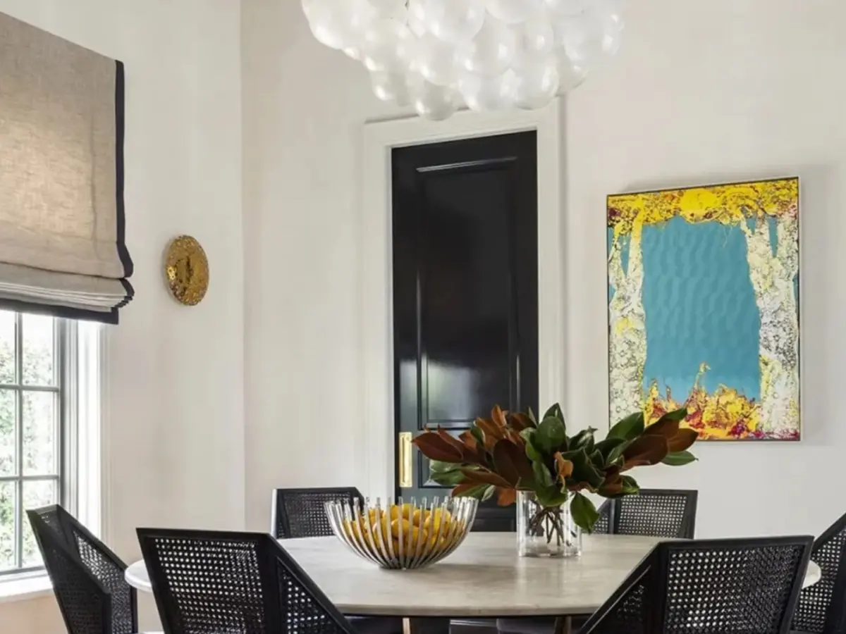
Complementary relationships, colors opposite each other on the wheel, are what create that charge. This is Albers again in the other direction. A warm-toned canvas gains intensity on a cool field, and a cool work sharpens against a warm one. A single saturated work on a pale wall is the same idea at lower volume, and it is the logic behind the gallery white box, a neutral envelope built so the art supplies all the color.
Hospitality and corporate lobbies are where contrast earns its keep. These rooms exist to make a first impression, and a high-contrast placement registers instantly. Contrast can also organize a large space. The Carnegie Museum of Art has used a bold color pairing to break a single exhibition into distinct sections and pace how visitors move through it. The same tactic can guide movement across a hotel floor or a corporate headquarters.
Frames decide who carries the contrast. Carnegie's exhibition designers note that ornate gilded frames can hold their own against bold wall colors, while a frameless contemporary work makes contrast harder and more important to get right. With no frame to mediate, the wall itself has to do the work, and the margin for error is smaller.
The risk of contrast is noise. Push it everywhere and the work and the room fight to a draw, with nothing winning. In a residence, relentless contrast can also tip a home into feeling like a showroom. Contrast does the most when it is rationed. One or two moments of real tension in a project carry far more weight than a building full of them.

The questions we ask before we hang anything
Across residential, hospitality, and corporate projects, the same short set of questions decides the call.
What is this work's job in this room, the focal point or the atmosphere? Focal points want contrast. Atmosphere wants harmony.
What is the work's value structure, and what ground will let it read? A light-keyed work needs a wall darker than its lights. A dark, dense work needs the opposite. Eastlake's rule from the 1840s still settles most of these.
How does the light change through the day? A relationship that sings at noon can go flat or muddy by late afternoon. Curators at the Carnegie test paint on sample boards carried into the actual gallery because highlights and shadows change how a color reads. We do the equivalent on site, which matters all the more in Houston and Dallas-Fort Worth interiors built around wide glazing and strong, shifting daylight.
Is this one work or part of a sequence? A standalone work can take a bold, contrasting ground. A series across connected rooms usually needs a harmonizing thread to hold together.
Does the work carry a frame, or does the wall carry it? That answer decides whether the contrast lives in the framing or in the paint.
These are the same judgment calls that make sourcing and placing art genuinely difficult for design teams working without a dedicated advisor. We have written before about the five challenges interior designers face in sourcing art, and color is where several of them converge.
White is a choice too: 2026 and the quiet envelope
It is worth saying plainly: white is never neutral. It is a decision with consequences. The point lands in 2026, because Pantone named a white, Cloud Dancer, as its Color of the Year, describing it as a calm, pared-back ground for an overstimulated moment. Expect more white-forward and near-white interiors this year as a result.
A quiet envelope sharpens the complement-or-contrast question rather than removing it. With the walls pulled back to almost nothing, every color decision lands on the art and a few accents. That makes a near-white room an ideal stage for a single high-contrast work, and an equally good setting for a tonal, harmonized hang where the art barely lifts off the wall. What it does not do is make the decision for you.
Museums learned the limits of white some time ago. When the Museum of Modern Art softened its permanent-collection galleries from stark white to a warm putty, the chief curator explained that white had simply been too harsh for early twentieth-century works. The lesson for homes and hospitality spaces is the same: reach for white because it serves a particular work, not by default.
How we work with designers and architects
None of this replaces a designer's vision. Our role is to protect it. We come in as the color relationship between a collection and an interior is being decided. We test works in the actual space and light, advise on the wall, frame, and lighting choices that make a work read as intended, and keep a collection coherent as it grows across a home or property. For corporate clients, that extends to collections built and managed as part of a workplace. For hotels and restaurants, it covers art programs designed for guest experience and brand.
The complement-or-contrast decision looks small next to acquisition budgets and architectural plans. It is often what determines whether a serious work looks like it was always meant for the room, or like it wandered in from somewhere else.
If you are working through where a collection meets a color scheme on a current project, contact our team to talk it through.


Begin a Conversation About Your Collection
Tell us about your space, your team, and the regional voice you want on your walls. Initial consultations are complimentary and discreet — and always begin with a conversation, not a pitch.