Art Selection for Open Floor Plans: Scale, Sightlines, and Visual Flow
A working framework for interior designers and architects specifying art in open-concept luxury homes across Houston and Dallas/Fort Worth.




Key Takeaways
- Homes are getting shorter in floor area and taller in volume. AIA's architect panel has tracked declining square footage alongside steadily rising ceiling volume, which is precisely the condition that makes conventionally scaled artwork disappear.
- Sightline collisions are the defining problem. In a room without partitions, several works are visible at once from a single vantage point. They have to be selected as an ensemble, not wall by wall.
- Every open plan needs one anchor. A clear primary focal point, with everything else deliberately subordinate, is what keeps connected zones from competing.
- Open plans concentrate conservation risk. Window walls, open kitchens, and aggressive HVAC cycling expose artwork to light, cooking aerosols, and humidity swings that closed rooms used to buffer.
- Freestanding work can define zones that walls no longer do, which is the most open-plan-specific tool available and the most consistently underused.
Our team collaborates with designers and architects from schematic design through installation. If you have an open-concept project in progress, start a conversation with C2 Art Advisors.
What the Open Plan Took Away
Open-concept living is not retreating from the luxury market, whatever the design press suggests. The 2024 U.S. Houzz Kitchen Trends Study, based on more than 3,400 renovating homeowners, found 43% opening their kitchens to adjacent spaces, up from 38% two years earlier, and among those, 64% remove the dividing wall entirely. NAHB reports that the majority of both first-time and repeat buyers prefer an open kitchen and family room.
When NAHB asked buyers what they would surrender to afford a home, 52% volunteered the dining room and 53% the home office, while only 21% would accept a smaller kitchen. The great room is where buyers concentrate their remaining square footage.
A real counter-current does exist. Designers and agents increasingly report client appetite for defined, purpose-driven rooms and quieter kitchens set slightly apart from entertaining space. The practical result is a hybrid: great rooms that still flow, but want moments of definition. Art is one of the few tools that supplies that definition without rebuilding anything.
What the open plan removed is the frame. A conventional room gave you a bounded wall, one primary sightline, and a controlled viewing distance.
A great room gives you none of these. A single canvas may be read from the kitchen island at thirty feet, from the sofa at twelve, and in passing from the stair landing above. It shares the visual field with three or four other works, the range hood, and whatever is on the countertops. Selecting art for this condition is closer to scoring for an ensemble than to hanging a picture.
Scale: Answering to Human Measure and Architectural Volume
Scale is where open plans punish inexperience most visibly, and the underlying trend is making it harder. AIA's Home Design Trends Survey, drawn from a panel of more than 300 residential architecture firms, has tracked overall square footage moving into negative territory while ceiling volume has held steady in positive growth every year since 2021.
Homes are getting smaller in plan and taller in section, with the custom and luxury segment the one category still growing. That combination, a compressed footprint under a tall volume, is exactly what makes a well-chosen artwork look accidental.
The governing convention remains the museum and gallery standard of hanging work so its vertical center sits 57 inches from the floor, a figure derived from average standing eye level and used to give differently sized works a shared midline. In taller rooms many designers shift that to 58 or 60 inches.
The discipline the convention enforces matters more than the number: artwork relates to human scale, not architectural scale. Raising a work to fill a two-story wall severs it from the people and furniture below, and it is the most common reason a correctly sized acquisition still reads as wrong.
Two separate ratios do the work here, and conflating them causes trouble. Over furniture, our team sizes a work or grouping to roughly two-thirds to three-quarters of the furniture width beneath it, with six to eight inches of clearance above a seat back. On an open wall, we size to 60 to 75% of the available wall span. Above a 90-inch sofa the first ratio points to something near 60 inches wide; on a 14-foot wall the second points somewhere near nine feet. Designers occasionally apply the furniture ratio to a wall, or the reverse, and the result either floats or crowds.
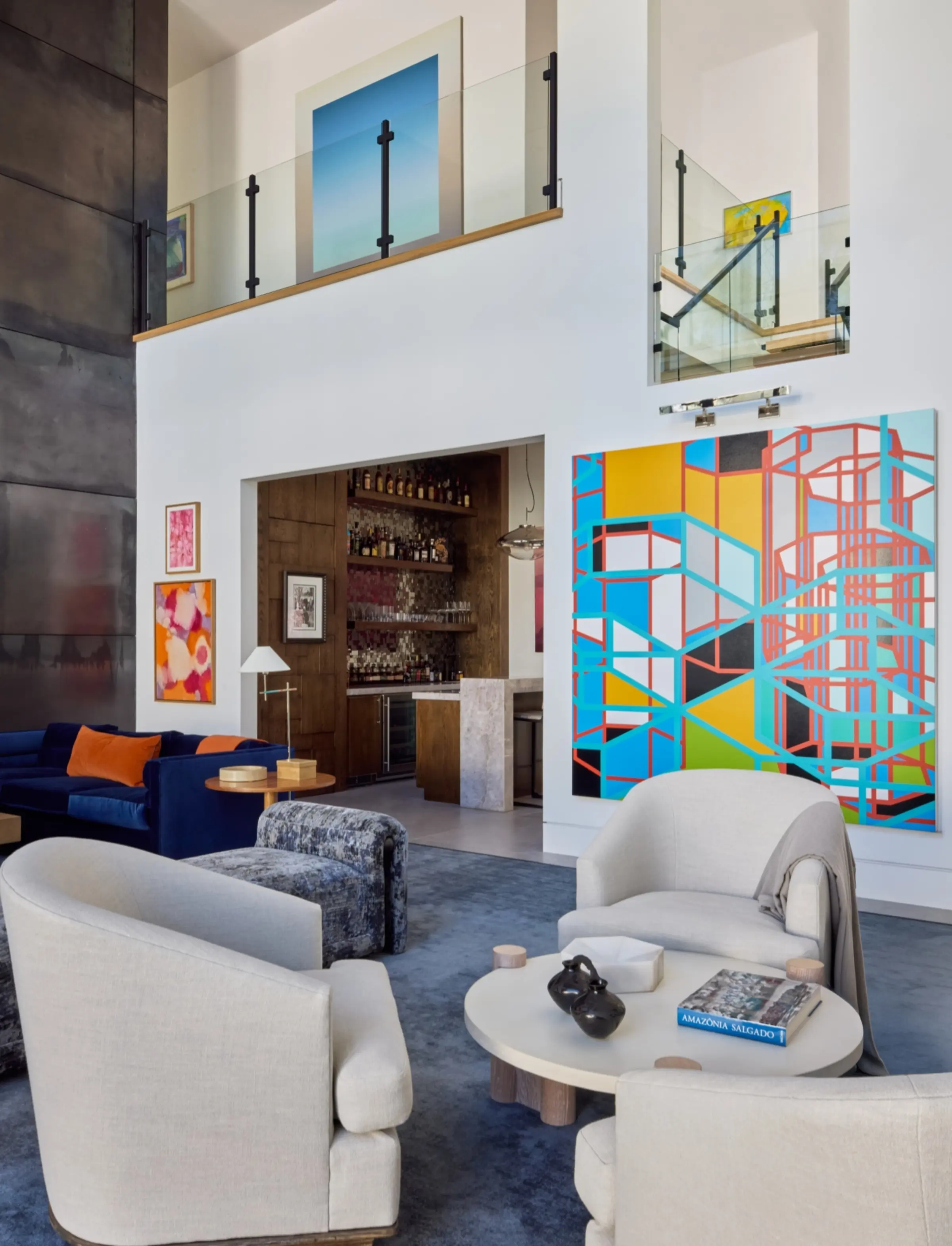
Double-height volumes are the exception that swallows all of this. A two-story great room or entry needs work of genuine physical scale, often a single monumental canvas or a vertically oriented composition, simply to register. Undersized artwork in these rooms is the correction we are called in to make most often, and the most expensive one, because the work usually has to be replaced rather than moved.
We are most often called in when the client has purchased a work without any guidance. They don’t particularly care for the artwork anymore and agree that the scale is wrong. In these cases, depending on what else is in the room, we will source a single large-scale work or grouping.
For example, if the overall collection is composed of paintings, this is the perfect opportunity to introduce a series of works on paper or photographs. A grouping inevitably takes more time, but it is always very rewarding when it comes together and makes the home feel more personal and collected.
Mapping Sightlines Across Connected Zones
In a closed room, sightline analysis is nearly a one-body problem. In an open plan it is the whole exercise. The defining phenomenon is what our team calls a sightline collision: two or more works visible in the same field of view from one standing or seated position, each competing for the same attention. When two strong works land in a single glance, they cancel each other.
We map open plans the way you map elevations, but from the inhabitant's moving vantage rather than the drawing's fixed one. We identify the primary positions, typically the entry approach, the kitchen island, the principal seating group, and any elevated landing, then trace what is visible from each.
We are looking for three things: candidate walls that fall inside the same cone of vision, the long diagonal views that open plans create across forty or fifty feet, and the raking angles from which a work will actually be seen most of the time. A canvas chosen for a head-on view can read as an awkward sliver from the direction people actually approach it. This analysis is more demanding than in a compartmentalized home, and it separates an ensemble that feels composed from one that feels merely furnished.
One Anchor, Then Everything Else
Hierarchy is the answer to collision. Every open plan needs a single dominant work that reads as primary from the main vantage points, supported by clearly subordinate works that reward closer or secondary viewing. When everything competes, nothing registers.
The anchor usually belongs to a commanding architectural feature you have already designed: the fireplace wall, the stair volume, the one solid expanse in a room otherwise given to glass. A bold, large-scale work there establishes the primary focal point and gives every other placement something to defer to. Secondary works are then scaled to support rather than rival it and positioned along circulation and transitional zones, where they are discovered in sequence.
That staged progression, from the socially assertive anchor of the entertaining zone toward quieter work in the connective spaces, restores some of the pacing that walls used to provide. We cover the underlying placement principles in more depth in our article on strategic art placement in Houston homes.
The Television Problem
No conversation about open-plan art gets far before the television comes up, and it deserves a direct answer rather than a workaround. In most great rooms the fireplace wall is simultaneously the best anchor location and the client's intended television location. Three approaches hold up in practice.
The first is to concede the wall and move the anchor. If the television is going above the firebox, that wall is spoken for, and the anchor should relocate to the strongest competing surface, often the wall terminating the longest diagonal view. This is usually the best outcome and the one clients resist until they see it modeled.
The second is to separate the two vertically or horizontally, giving the television its own recessed or millwork-framed zone and siting a substantial work on the adjacent plane so the two are never in the same cone of vision from the primary seating. This requires coordination during design development, not after drywall.
The third is a mechanized or sliding art panel that conceals the screen. These work, and we have specified them successfully, but they impose real constraints: the artwork must be dimensionally compatible with the mechanism, the mechanism dictates depth and backing, and the work is subject to repeated movement, which rules out fragile media and most works on paper. Clients tend to assume this option is neutral. It is a genuine limitation on what can be acquired, and it belongs in the conversation early.
What does not work is treating the television as invisible during selection and then discovering, at install, that the room has two focal points at the same height on the same wall.
Freestanding Work and the Return of the Room
Because open plans removed the walls, the most useful tool for reorganizing them is often work that does not need a wall. Sculpture, freestanding and pedestal-mounted work, and substantial three-dimensional objects can define a zone without enclosing it, which is precisely what clients asking for "more defined spaces" are actually requesting.
A sculpture sited at the threshold between a dining zone and a living zone reads as a soft boundary from every direction. It marks a transition, gives circulation a reason to bend around it, and creates separation that a rug or a furniture group cannot. In double-height spaces, three-dimensional work solves a problem that flat work cannot: it occupies the volume rather than the wall plane, and it changes as inhabitants move around it, which is the one thing an open plan guarantees they will do.
The technical requirements are real. Freestanding work needs floor loading confirmed, clearance from circulation, and lighting planned from more than one direction to model the form. In rooms with large glazed walls, we also evaluate how the work reads as a silhouette against daylight, which is often how it will most frequently be seen.
Cohesion Without Monotony
Because open-plan zones are seen together, the collection must cohere as one composition. Because they are experienced in sequence, it also has to vary, or it flattens into wallpaper. That tension is specific to the open condition, where there is no doorway to reset the eye.
Cohesion comes from disciplined threads rather than matching: a consistent palette temperature, a shared medium or a deliberate dialogue between two, a recurring formal motif, or a unifying framing and mounting language carried across every zone. Rhythm comes from controlled variation inside those threads, alternating scale, orientation, and visual density so the eye is paced as it travels from kitchen to dining to living.
Negative space does real compositional work here. In a room without partitions, the calm intervals between works are what allow each one to register, and over-hanging an open plan collapses the breathing room that makes the anchor legible in the first place. Restraint usually reads as confidence.
What Open Plans Do to the Artwork
Open plans concentrate conservation and performance risk that closed rooms once distributed. These constraints bear directly on your liability and your client's investment.
Daylight. The window walls that define open-plan luxury are the greatest single threat to the artwork inside them, and Houston and Dallas exposures make it acute. Light damage is cumulative and irreversible, and as CCAHA frames it, exposure is illuminance multiplied by time: one hour at 100,000 lux, roughly direct sunlight, equals 200 hours at 50 lux.
The standard recommendation for sensitive objects is 50 to 100 lux. The Canadian Conservation Institute advises eliminating ultraviolet radiation wherever it can be eliminated rather than managing it. In practice: keep light-sensitive media off walls in the direct path of afternoon sun, specify UV-filtering glazing and window film, and reserve the sunlit walls for more durable work.
Accent lighting. We specify to the framework in the Illuminating Engineering Society's Recommended Practice for Museum Lighting (RP-30), using low-UV, low-heat LED sources around 3000K with high color rendering, aimed to eliminate glare on glazed work. In an open plan this has to be coordinated with the architectural and decorative layers you have already designed, which is why it belongs in design development rather than in a punch list.
Kitchen adjacency. The open kitchen introduces a hazard the closed kitchen contained. Cooking releases fine particulate matter, volatile organic compounds, and airborne grease that stay suspended and then settle, forming films that are acidic and difficult to reverse on unglazed surfaces. We keep unglazed and light-sensitive work out of the range's direct aerosol path, favor glazed or more durable work inside the kitchen's zone of influence, and treat high-capacity ventilation as collection protection as much as comfort.
HVAC and humidity. Conservation practice targets relative humidity near 50%, commonly held within a 45 to 55% band, with stability valued above hitting an exact number. Repeated swings fatigue canvas, panel, and paper more than a steady level slightly off ideal. Tall open volumes with large glazed areas and aggressive cycling are prone to exactly those swings, and Houston's humidity raises the stakes. Keep key walls away from supply diffusers and confirm zoning early.
Acoustics and traffic. Open plans with hard surfaces and high ceilings generate reverberation, and the large uninterrupted walls that are candidates for the anchor are frequently the same walls a consultant wants for acoustic treatment. Coordinate the two rather than discovering the conflict at install. Circulation also demands adequate clearance and secure cleat-based mounting, since open plans lack the buffering that doorways and corners once provided.
Specify Art During Design Development
Almost every problem above is cheaper to solve on paper. Blocking and backing for heavy work, dedicated junction boxes and switching for accent lighting, UV glazing, HVAC zoning away from key walls, floor loading for freestanding work, television infrastructure, and simply reserving the right solid wall for the anchor are all trivial in schematic design and disruptive afterward.
When art enters only at the reveal, the outcome is familiar: beautiful work that does not fit the walls that were built, lighting that cannot be aimed, and sun-exposed placements with no alternative left. Joining during design development lets acquisition decisions follow the architecture instead of fighting it.
How We Work With Your Practice
Design professionals consistently describe the same four constraints: art world access, justifying the investment to clients, the logistics and liability of handling, and protecting their own credibility at the reveal.
We wrote about these at length in five challenges interior designers face in sourcing art, and open plans intensify every one of them, because in a room where everything is visible from everywhere, there is nowhere to put a mistake.
Our role is to interpret your vision rather than impose one. You hold the spatial understanding and the design narrative. We bring gallery, auction, and private-collection access, placement analysis, conservation judgment, and installation execution, and we keep all of it behind the scenes so your client sees one unified team.
The market context makes the stakes concrete. According to the Texas REALTORS® Sales of Million-Dollar Homes report, analyzed by the Texas Real Estate Research Center at Texas A&M, 14,418 Texas homes sold at or above $1 million between November 2024 and October 2025, a 12% year-over-year increase and a state record.
Dallas-Fort Worth accounted for 38% of those transactions and Houston 27%. In River Oaks, Tanglewood, Memorial, and West University, and in Highland Park, University Park, and Preston Hollow, the integration of art and architecture is one of the visible measures of a project's sophistication.
To plan art strategically for your next open-concept project, from schematic design through white-glove installation, explore our residential art advisory services, review our residential portfolio, or contact our team. We partner with designers and architects throughout Houston and Dallas/Fort Worth.


Begin a Conversation About Your Collection
Tell us about your space, your team, and the regional voice you want on your walls. Initial consultations are complimentary and discreet — and always begin with a conversation, not a pitch.